Sunday, October 28, 2012

Which is More Important? Color or Value?


It's almost like the chicken and the egg.

In abstract art, the relationship between color and value is not as important as it is in representational or realistic art.  In non-representational art, the whole idea is to excite the senses and create a visual feast about texture, color, shape and other principles of design. In abstract art, an artist can head in any direction he pleases! Any of the art principles such as color or value can be the priority. It all depends on what you want to emphasize.

In an abstract painting, a ball might look like this:

However, in realistic art, the viewer must take his clues from the values depicted in the painting in order to understand the form of the subject. For example, we believe that the ball below is round because we can see the value changes from the light side to the shadow side. In this case, value is more important.

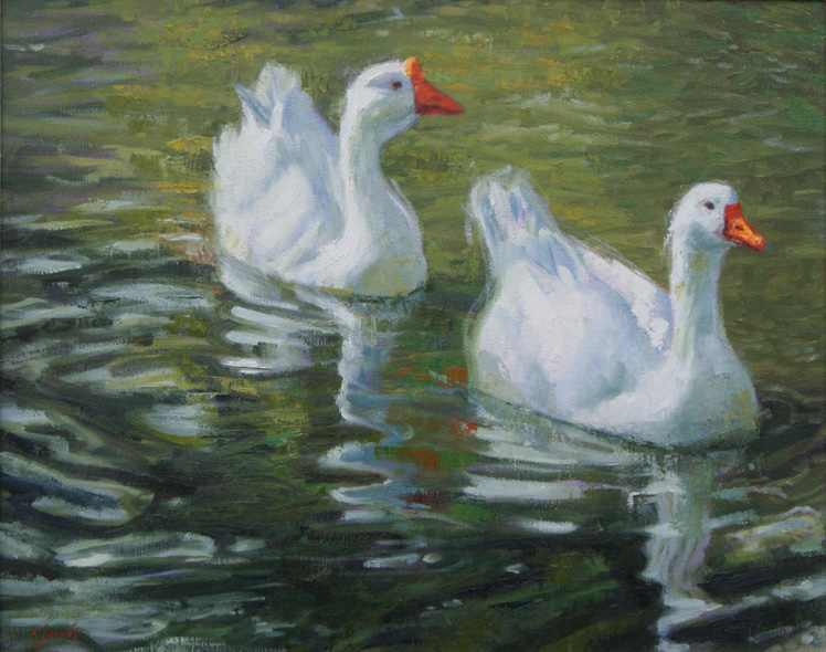
 In a realistic painting, a ball might look more like this:

Another funny thing about value is that even If you use strange colors in your painting, as long as the values are correct, your representational work will still read accurately. So, in the case of realistic work, I believe that value is more important than color!


When when you are trying to capture the illusion of three dimensions on a two-dimensional canvas, your values must be portrayed accurately. 

A common error for most painters is to put too many details in a painting at the beginning of the block-in process. Another area that can weaken a painting is to select values that are too light for the shadow side or too dark for the light side. When the values get scrambled, the painting becomes confusing for the viewer. 

So, how to you learn to see the values and paint them accurately? 

Here's a great exercise. 

Using the four values below, paint a simple black and white study of your subject. Observe your subject closely. Even though you can see 10 or 12 different shades of gray, try limiting yourself to only these four values.
  • white
  • light gray
  • dark gray
  • black
Use your eyelashes as a filter by squinting your eyes.  This will help you to mass together areas of similar value and help you to eliminate unimportant detail.  This is what the ball might look like in this value exercise:

Now apply this concept to your painting.  Before you begin painting with color, try painting using the four values. Remember to simplify! Give it a go and see what happens. 


Of course color and value are both important in your painting - but if you are trying to get a good likeness of a scene, simplify your view and make sure you get your values correct before you paint the details into your painting!


Thursday, October 25, 2012

Are Animal Paintings Considered Figurative or Landscape?


When there are animals in a painting, should you categorize it withing the figurative section of your website or post it in with your landscapes? 

Good question!


According to the experts, figurative art, beginning in antiquity, has a lineage that runs through many schools of modern and contemporary art. The term figurative art commonly refers to art that has the human figure or animal figures as its subject. 

Human and animal figures bring animation into a painting.  Where there are animals and people - there is movement. A sense of life. 


I first became familiar with this concept when I tried to enter a landscape painting into a competition. Even though the majority of the work was indeed a landscape, I had painted some little tiny cows into the background area!  

Much to my disappointment, my painting was considered to be figurative work and I could not enter it into the landscape competition. 

So, now you know.

When entering any competition, find out in advance which categories have been listed for artwork submission. Besides the media classifications such as watercolor, oil/acrylic, and mixed media, there could be divisions such as:
  
  • Figurative
  • Landscape
  • Animal/Wildlife
  • Still life
Find out in advance which categories apply to your painting, then go ahead and put some life into your work!   


Sunday, October 14, 2012

In Spite of The Rain

We braved the October rain to paint en plein-air at a six-hour workshop held in Sugar House Park yesterday and in spite of the cold damp air, we put our brushes to the canvas and persevered until we each had two or three creations. 

Yep, we totally rocked it!  


Sugar House Park was rich and colorful and the end-of-summer greens were beginning to show the first signs of autumn. Lavender clouds skimmed the top of Mount Olympus and in the foothills below, the red and orange hues peeked out in a softer note.  


We began by focusing on painting a value study using four values: black, white, and two shades of gray.  This enabled us to work out our compositions and freed us from the complexity of having to deal with color.


Once our value studies ware complete, we worked on a producing a color study.  The most difficult concept with both paintings was learning to simplify the shapes and eliminate detail. Learning to mass like-values together proved to be a challenge too. Hopefully, both studies will be a tangible reminder of how "less is more."


I think we all grew as we endeavored to capture the mood of the scene and replicate the subtlety of each beautiful color. I believe that growth occurs "on the edge" and if we don't push ourselves to broaden our limits, we will not grow!

Yesterday, I completely immersed myself in the experience and soaked up the sight of the pond, the sounds of the gulls and even felt myself enjoying the chill in the air...

...in spite of the rain!